Rooms & Occasions
How to Style a Sideboard or Buffet: A Simple, Layered Formula
7 min read
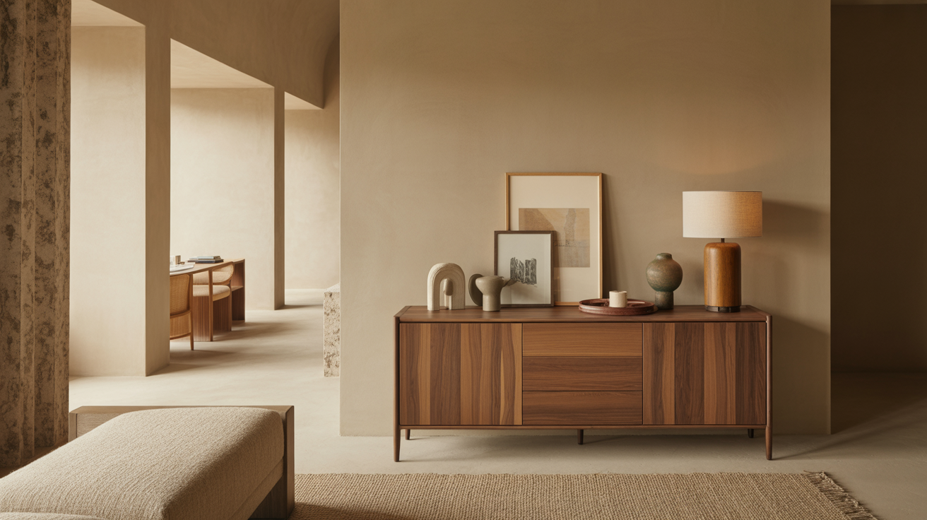
How to style a sideboard or buffet so it looks intentional: the layered formula, art and lamp proportions, the rule of three, and what to leave off.
A sideboard styles up the same way a good vignette does: layer something tall at the back, group objects in odd numbers in front, and leave breathing room between them. The piece does real work — storage below, a serving surface when you host — so the top should look intentional without becoming so precious you can't set down a platter. Here's a simple, repeatable formula that works for a dining buffet, an entry credenza, or a living room sideboard.
First, what the sideboard is for
A sideboard, buffet, and credenza are essentially the same low storage cabinet wearing different names depending on the room. In a dining room it's a buffet — a place to stage food when serving and stash linens, serveware, and candles inside. Anywhere else it's a sideboard or credenza doing display-plus-storage duty.
That dual purpose shapes how you style the top. In a dining room especially, keep the center clear enough to land a serving dish or two. Style the ends and the back, leave the working middle open, and you get a top that looks finished every day and clears in five seconds when you're plating a meal. A buffet you have to disassemble before dinner isn't styled — it's blocked.
The layered formula
Almost every well-styled sideboard follows the same three-layer logic. Build it back to front:
- The back layer (height and anchor). This is what gives the whole vignette structure. Lean a large piece of art or a mirror against the wall, or hang one centered above. This single tall element does most of the work.
- The mid layer (the working objects). In front of the art, place your functional-but-handsome pieces: a lamp, a tall vase with branches, a stack of books. These bridge the gap between the tall back and the low front.
- The front layer (the small touches). Low objects close to the front edge — a small bowl, a candle, a short stack, a sculptural object. They finish the composition and draw the eye down.
The reason this works is that it creates a gentle staircase of heights from the wall forward, so your eye travels naturally instead of hitting a flat row. A line of same-height objects reads as a shelf; a layered arrangement reads as styled.
Proportions: art, lamps, and the rule of two-thirds
The fastest way to make a sideboard look professional is to get a couple of proportions right.
| Element | Target proportion |
|---|---|
| Art / mirror width above a sideboard | About ⅔ to ¾ of the sideboard's width |
| Gap between art bottom and sideboard top | 6–8" |
| Total styling height (tallest object) | Up to about ⅔ the height of the art behind it |
| Table lamp height for a sideboard | 28–34" overall is a common, balanced range |
| Open / negative space on the surface | At least ⅓ of the top left clear |
The big one: art or a mirror should span roughly two-thirds to three-quarters of the sideboard's width. A small piece floating over a long cabinet is the most common styling miss — it leaves the sideboard looking unanchored. When in doubt, go bigger, or group several smaller pieces to read as one larger shape. (The same proportion logic applies to a bookshelf — our bookshelf styling guide covers grouping and balance in depth.)
Compose with groupings, not a row
With the layers and proportions set, the composition itself comes down to a few reliable moves:
- Work in odd numbers. Group objects in threes — a tall, a medium, and a low — rather than pairs or evenly spaced singles. Odd-numbered groupings read as relaxed and collected; even ones feel stiff.
- Or go fully symmetrical, on purpose. The alternative to a loose asymmetric grouping is deliberate symmetry: a matching pair of lamps flanking a centered piece of art, identical on both ends. Symmetry suits formal dining rooms; asymmetry suits casual, layered spaces. Pick one — the in-between is what looks accidental.
- Vary heights, shapes, and textures. Pair something tall and thin (a vase of branches) with something low and round (a bowl), in different materials — wood, ceramic, glass, metal. Contrast is what makes a small grouping interesting.
- Add one organic element. Greenery, branches, a single stem, or a small plant keeps the arrangement from feeling like a still life. It's the touch most people skip and the one that brings the whole thing to life.
- Use a tray or a stack as a base. A tray corrals small items into one tidy group; a stack of books gives a low object some lift. Both create the layering that makes a surface look considered.
What to leave off
Restraint is what separates a styled sideboard from a cluttered one. The most common over-styling mistakes:
- Too many small objects. A scatter of tiny things reads as clutter. Edit to a few pieces with some scale, and group them.
- Everything the same height. A flat row has no rhythm. If three things are the same height, lift one on a stack of books or swap it for something taller.
- Filling the whole top. Leave at least a third of the surface open — and in a dining room, keep the center clear for serving. Negative space is what makes the kept objects look chosen.
- Crowding the art. Don't pile objects so high they cover the bottom of the art. Leave a sliver of the artwork visible above the tallest piece.
- Forgetting the function. If you can't open a drawer or set down a platter, the styling has won at the cost of the furniture. Keep it livable.
Match the styling to the room
A sideboard reads differently depending on where it lives, so tune the styling to the setting:
- Dining room buffet: Lean formal and symmetrical, keep the center clear for serving, and store candles and serveware inside so they're at hand when you host.
- Entry credenza: Add a landing function — a tray or bowl for keys, a lamp for a warm welcome, a mirror above to check yourself on the way out.
- Living room sideboard: Hold media gear or barware inside; up top, lean into display — art, a lamp, books, and a few sculptural objects.
Whatever the room, the formula holds: a tall anchor at the back, a layered grouping in front, odd numbers, one living element, and a third of the top left to breathe.
Shop this guide
- Natural Solid Wood Three Drawer Sideboard with Five Doors
- 76" Brown Distressed Solid Wood Sideboard Soft Close
- Brown Solid Wood Carved Geometric Sideboard with Four Doors
The short version
- Build the top in three layers: a tall anchor at the back, working objects in the middle, low touches in front.
- Size art at two-thirds to three-quarters of the sideboard's width, hung 6 to 8 inches above.
- Group in odd numbers (or go deliberately symmetrical), vary heights and textures, and add one organic element.
- Leave at least a third of the surface clear — and on a dining buffet, keep the center open for serving.
- Tune the styling to the room: formal for a buffet, a landing zone for an entry, display-forward in a living room.
A sideboard is storage, a serving surface, and a styling moment in one. Shop dining — sideboards, buffets, and the pieces that make a dining room as functional as it is finished.
Frequently asked questions
How do you style a sideboard or buffet?
Build in three layers: a tall anchor at the back (art or a mirror), working objects in the middle (a lamp, a vase, books), and low pieces at the front (a bowl, a candle). Group items in odd numbers, vary the heights, add one organic element, and leave at least a third of the top clear.
What size art should go above a sideboard?
Art or a mirror should span about two-thirds to three-quarters of the sideboard's width, hung 6 to 8 inches above the top. A piece that's too small leaves the sideboard looking unanchored — when in doubt, go larger or group several pieces to read as one.
How do I style a buffet for everyday use?
Style the ends and the back layer but keep the center of the top clear so you can land a serving dish when you host. Store candles, linens, and serveware inside the cabinet. That way the buffet looks finished every day and clears instantly when you need the surface.
Should a sideboard be styled symmetrically or asymmetrically?
Either, as long as you commit. Symmetry — a matching pair of lamps flanking centered art — suits formal dining rooms. Asymmetry — a loose, odd-numbered grouping — suits casual, layered spaces. The accidental-looking middle ground is what to avoid.
How do I keep a sideboard from looking cluttered?
Edit to a few pieces with some scale rather than many tiny objects, vary the heights so there's rhythm, and leave at least a third of the top open. Group items instead of spacing them evenly, and keep the function usable — you should still be able to open the drawers.