Color, Material & Textiles
How to Build a Neutral Palette That Doesn't Feel Boring
6 min read
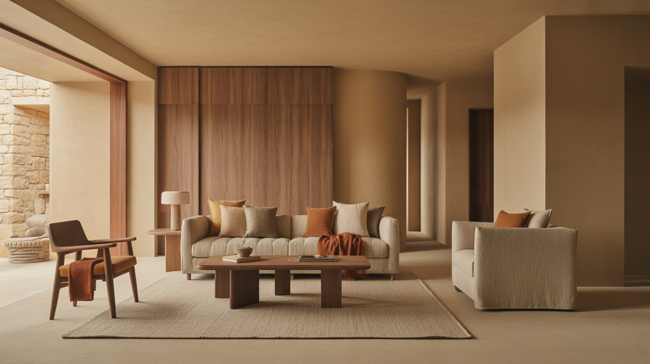
How to build a neutral color palette that feels rich, not flat: warm vs. cool neutrals, the 60-30-10 split, texture and contrast tricks, and what makes beige dull.
A neutral palette goes boring for one reason: it's flat. Everything sits at the same tone, the same temperature, and the same texture, so there's nothing for the eye to do. A neutral room that works keeps the colors quiet but builds in contrast through value, undertone, and texture — which is how a room of beiges and creams ends up feeling rich and considered instead of like an empty rental.
Here's how to build a neutral palette with depth.
Why neutral rooms fall flat (and how to fix it)
Neutral doesn't mean "no contrast." It means the contrast comes from value and texture rather than hue. A colorful room leans on the difference between blue and rust. A neutral room has no such crutch — so if every surface is also the same lightness and the same smoothness, the whole thing collapses into one plane.
The three levers that bring a neutral room to life:
- Value — the range from light to dark. A flat room is all mid-tones. A rich one runs from a near-white to a deep charcoal or espresso.
- Undertone — the warm or cool bias hiding in every "neutral." Mixing undertones thoughtfully (mostly warm, with a cool note or two) adds dimension.
- Texture — rough against smooth, matte against a little sheen. In a quiet palette, texture does the work color usually does.
Get all three working and "beige" becomes layered and warm. Miss them and you get the lifeless version everyone fears.
Warm vs. cool neutrals — and why it matters
Every neutral leans warm or cool, and mixing them carelessly is the fastest way to make a room feel "off." The undertone is the bias you see when you put two neutrals side by side.
| Neutral family | Leans | Examples | Feels |
|---|---|---|---|
| Warm neutrals | Yellow/red/brown | Cream, sand, oatmeal, greige, camel, taupe | Cozy, inviting, sunlit |
| Cool neutrals | Blue/green/gray | Cool gray, slate, putty, foggy white | Crisp, calm, architectural |
For a warm, inviting room — the LoftLoom default — build on warm neutrals (sand, oatmeal, greige, camel) and bring in cool notes sparingly for contrast: a charcoal, a slate-toned stone, a piece of black metal. The reverse also works for a cooler, more architectural feel. What you want to avoid is a fifty-fifty muddle of warm and cool with no clear lead — that's what reads as dingy.
A quick test: hold your fabric, paint chip, or wood sample next to a true white. The bias that jumps out is the undertone. Pull your palette toward one temperature and let the other play a supporting role.
The 60-30-10 split for neutrals
Even an all-neutral room benefits from a proportion rule. The classic 60-30-10 split keeps things balanced:
- 60% — the dominant neutral. Walls, large rugs, the biggest upholstery. Usually your lightest, quietest tone (a warm white, sand, or oatmeal).
- 30% — the secondary neutral. A clear step in value from the dominant — a mid-tone greige, a taupe, a natural wood tone. This is the contrast that keeps the room from going flat.
- 10% — the accent. Your darkest value or a cool note: charcoal cushions, a black metal lamp, a deep-toned throw, espresso wood. Small but essential — it's the punctuation.
The mistake that flattens rooms is collapsing the 60 and the 30 into nearly the same tone. Push them apart in value. The wider the gap between your lightest and darkest neutral, the more alive the room feels — even with zero actual color.
Texture is how neutrals get depth
In a neutral room, texture isn't decoration — it's the main event. When colors are quiet, your eye reads surface differences as warmth and richness. Layer them deliberately:
- A textural rug as the base — wool, jute, or a nubby weave grounds the room and adds the first layer of depth.
- Mixed upholstery weaves — if the sofa is smooth linen, add a bouclé chair; if it's a flat weave, add a chunky knit throw. Contrast the surfaces.
- Natural materials — wood grain, stone, ceramic, rattan. Each catches light differently and breaks up the smoothness.
- One matte-and-sheen pair — most surfaces matte and calm, with a single warm-metal accent (a brass lamp, a bronze pull) for a small line of light.
This is the whole engine of a quiet room, and it's worth its own deep dive — our texture pairing guide covers exactly how to combine wood, linen, stone, and metal so a neutral scheme reads layered instead of flat. A handful of well-chosen decor pieces in varied materials does more for a neutral room than any amount of color.
Build the palette, step by step
A reliable order for putting it together:
- Pick your temperature. Warm or cool. Commit. This single decision keeps everything that follows coherent.
- Choose the dominant light neutral. Your 60% — walls and big pieces. Test it against a true white to confirm the undertone.
- Choose a mid-tone secondary. Your 30% — a clear step darker. This is where most flat rooms go wrong; make the gap real.
- Choose the dark accent. Your 10% — charcoal, espresso, black metal, or a deep cool note.
- Layer texture across all three. Rough, smooth, matte, one bit of sheen.
- Add one optional living color. If you want a hint of hue, a single muted tone — sage, terracotta, dusty blue — woven through cushions or art adds life without breaking the neutral feel. Keep it to one, and keep it muted.
This restrained, texture-forward approach is the foundation of warm minimalism — a neutral palette done with intention and good editing is most of the way to that look.
The short version
- Neutral rooms go boring when they're flat — same tone, same temperature, same texture everywhere.
- Bring depth through value (a wide light-to-dark range), undertone (lead with one temperature), and texture.
- Use a 60-30-10 split, and make the gap between your dominant and secondary neutral a real one.
- Layer rough-against-smooth surfaces; in a quiet palette, texture does what color usually does.
- Optionally add a single muted accent hue — one, and keep it quiet.
A great neutral room is built from materials, not bright colors. Explore the collection — organized around the warm neutrals and natural textures that make a quiet palette feel rich.
Frequently asked questions
How do you make a neutral palette not boring?
Build in contrast through value, undertone, and texture instead of color. Push your lightest and darkest neutrals far apart in value, commit to one temperature, and layer rough-against-smooth textures. Flat neutral rooms are flat because everything sits at the same tone and the same smoothness.
What are warm neutrals vs. cool neutrals?
Warm neutrals lean yellow, red, or brown — cream, sand, oatmeal, greige, camel — and feel cozy and inviting. Cool neutrals lean blue, green, or gray — cool gray, slate, putty — and feel crisp and architectural. Hold any neutral next to true white to see which way it leans.
How many neutral colors should a room have?
Use a clear three-step value range — a light dominant (about 60%), a mid-tone secondary (about 30%), and a dark accent (about 10%) — plus varied textures. The spread between light and dark matters more than the number of colors.
Can you mix warm and cool neutrals?
Yes, and a little mixing adds dimension — but let one temperature lead. A warm room with a cool charcoal or slate accent looks intentional; a fifty-fifty split with no clear bias reads muddy and dingy.
How do I add interest to a neutral room without color?
Layer texture: a nubby rug, mixed upholstery weaves, natural wood and stone, and one matte-and-metal pairing. In a quiet palette, surface differences do the work color usually does. One muted accent hue is optional, not required.