Style & Authority
The Texture Pairing Guide: Wood, Linen, Stone, and Warm Metal
7 min read
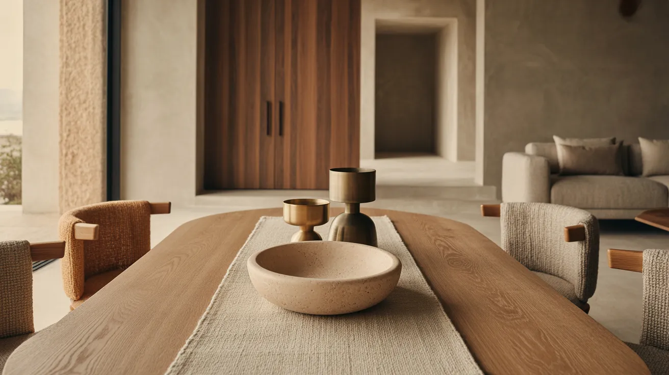
How to mix textures in interior design: a practical guide to pairing wood, linen, stone, bouclé, and warm metal so neutral rooms feel layered, not flat.
Mixing textures in interior design means combining materials with different surface qualities — rough with smooth, matte with sheen, hard with soft — so a room has depth even when its colors are quiet. It's the reason two all-beige rooms can feel completely different: one flat as a catalog page, the other rich enough to touch. Texture is what color-shy rooms run on, and pairing it well follows a handful of learnable rules.
Why Texture Is the Quiet Engine of a Room
Strip the color out of any room you've ever loved and ask what's left. Usually: grain, weave, nap, and stone — surfaces that catch light differently from their neighbors. Your eye reads these differences constantly and registers them as warmth and depth, even when it can't name them.
This is why texture matters most in neutral and minimalist rooms. A colorful room can lean on contrast between hues. A room of oatmeals and sands has no such crutch; if every surface is also smooth and matte, the whole thing collapses into one plane. The fix is never more stuff. It's more difference between surfaces — which you can achieve with the same number of objects, chosen better.
The Four Core Materials
Most warm, modern rooms are built on four textures. Learn what each one contributes and the pairing logic becomes intuitive.
Wood is the connector. Its grain reads as both pattern and warmth, and it gets along with every other material on this list — which is why nearly every great room has wood somewhere visible. Matte and oiled finishes show more texture than glossy ones.
Linen is the softener. Its slubby, lived-in weave takes the formality out of whatever it touches. Linen wrinkles; that's a feature. It signals ease the way a pressed synthetic never can.
Stone is the cool note. Marble, travertine, slate, or honest ceramic — stone adds weight and a slight temperature drop that keeps an all-warm room from going syrupy. A little is enough: a lamp base, a tray, a side table top.
Warm metal is the punctuation. Aged brass and bronze tones catch light in small bright lines — a lamp stem, a cabinet pull, a frame. Metal is the only one of the four with real shine, which is exactly why it's used last and least.
The supporting cast: wool (underfoot warmth, the best rug fiber for texture), bouclé (looped, dimensional, the most tactile upholstery weave going), leather (smooth but warm, ages beautifully), and unglazed ceramic (stone's handmade cousin).
The Pairing Table
| Texture | Reads as | Pairs beautifully with | Where it earns its keep |
|---|---|---|---|
| Wood (matte/oiled) | Warm, grounding | Everything — especially linen and stone | Tables, shelving, frames, floors |
| Linen | Relaxed, soft | Wood, wool, leather | Curtains, bedding, slipcovers, cushions |
| Stone/ceramic | Cool, substantial | Wood, warm metal, bouclé | Lamp bases, tabletops, vessels, trays |
| Warm metal | Crisp, light-catching | Stone, wood, dark tones | Lighting, hardware, frames — small doses |
| Wool | Dense, warm | Linen, leather, wood | Rugs, throws |
| Bouclé | Plush, dimensional | Smooth woods, stone, metal | Accent chairs, ottomans, cushions |
| Leather | Smooth, warming with age | Wool, linen, wood | One chair or bench per room |
The pattern hiding in this table: every strong pairing puts an opposite next to an opposite. Plush bouclé against smooth stone. Crisp metal against soft linen. Rough wool under sleek leather. Likeness is what makes rooms flat.
The Four Rules of Mixing Textures
1. Contrast hard and soft in every grouping
Wherever the eye lands — a coffee table, a shelf, a seating corner — it should find at least one hard surface and one soft one. A wood table with a ceramic bowl and a linen runner. A bouclé chair beside a stone-topped side table. If a corner feels off, it's usually all-hard (cold) or all-soft (shapeless).
2. Keep most surfaces matte; spend sheen carefully
Matte surfaces absorb light and feel calm; shiny ones reflect and demand attention. A good room is roughly 90 percent matte, with sheen reserved for warm metal accents and maybe one glazed ceramic. When a neutral room feels cheap, excess shine is the usual culprit.
3. Repeat each texture at least twice
One bouclé pillow looks like an accident; a bouclé chair across the room makes it a decision. Repetition is what turns a collection of materials into a scheme. Twice is enough — three times for the dominant texture.
4. Stop at five textures per room
Three textures is a minimum for depth; five is a comfortable ceiling. Beyond that, surfaces start competing and the calm you were building evaporates. Count them: in most well-made rooms you'll find wood, one or two weaves, one stone note, one metal. Done.
Texture, Room by Room
Living room
Build from the floor up: a wool or wool-blend rug establishes the base texture (the area rug selection is where this layer starts), the sofa adds a substantial weave, and then you place opposites — a bouclé accent chair if the sofa is smooth, a stone or ceramic lamp on a wood side table, one brass-toned reading lamp. Finish with linen cushions in the same color family as the sofa so the texture contrast does the talking, not the color.
Bedroom
Bedding is a texture sandwich: smooth cotton or linen sheets, a heavier matelassé or washed-linen duvet, a wool throw folded at the foot. Add one rough note (a jute or wool rug underfoot) and one smooth one (a ceramic or stone lamp base), and the room is done. Bedrooms need fewer textures than living rooms — four is plenty.
Dining room
The table provides wood; resist matching it with all-wood everything. Upholstered or woven-seat chairs add softness, stoneware adds the ceramic note, and a metal or stone pendant overhead completes the set. A linen runner is the cheapest texture upgrade in the house.
Entry and small spaces
One pairing is enough: a wood bench with a wool or sheepskin-style cushion, or a stone tray on a wooden console. Small spaces prove the principle fastest — two well-chosen textures read as intention, while five read as storage.
How to Add Texture Without Buying More Stuff
Texture is the rare design upgrade that often involves replacing, not adding.
- Audit what you have. Count distinct textures in the room. If everything is smooth cotton and painted wood, you've found the problem.
- Swap covers, not furniture. Trade flat cotton cushion covers for linen and bouclé ones. Same pillow count, twice the depth.
- Re-dress one surface. Clear the coffee table, then restyle with exactly three objects in three materials — wood, ceramic, something soft-bound or woven.
- Choose the rug for fiber, not pattern. A textural wool weave in a quiet tone outworks a busy print in a flat fiber.
- Add the stone and metal notes last and smallest. A single stone object and one warm-metal lamp finish a room; a dozen of each unfinish it. A few well-chosen decor pieces cover this layer completely.
This is also where texture connects to the larger styles built on it: warm minimalism is essentially this guide plus ruthless editing, and japandi is this guide plus low furniture and two wood tones.
The Short Version
- Texture is what gives quiet-colored rooms their depth: rough against smooth, hard against soft, matte against a little sheen.
- Build on four cores — wood, linen, stone, warm metal — with wool, bouclé, and leather in support.
- Keep 90 percent of surfaces matte, repeat every texture twice, and stop at five per room.
- Work floor-up: rug fiber first, upholstery second, stone and metal accents last and smallest.
- Upgrade by swapping surfaces, not accumulating objects.
When a room needs its next layer, explore the collection — it's organized around exactly these materials, so the pairing logic comes built in.
Frequently asked questions
What does mixing textures mean in interior design?
It means combining materials with different surface qualities — rough, smooth, plush, hard, matte, sheened — so the room has visual and tactile depth. It's how neutral rooms avoid flatness without adding color or pattern.
How many textures should one room have?
Three to five distinct textures. Fewer than three reads flat; more than five gets noisy. Repeat each texture at least twice so it looks intentional.
How do I add texture to a neutral room?
Start with fiber: a wool rug, linen curtains or cushions, one bouclé piece. Then add one stone or ceramic object and one warm-metal accent. Keep colors in the same family so the surfaces, not the hues, create the contrast.
Can you mix metals in one room?
Yes — two metals work if one clearly dominates. In warm rooms, lead with brass or bronze tones and let black steel play the supporting role. Keep finishes consistent within each fixture.
Does texture matter more in minimalist rooms?
Considerably. Minimalist rooms have fewer objects and quieter colors, so each surface carries more weight. In a minimal room, texture isn't decoration — it's the main event.